If you’ve read this blog since I started in August of 2012 (so crazy to think about), then you’ve probably noticed the design changes it has gone through. To be honest, I’ve never liked the layout of my blog, so I’ve messed with it several times, diligently trying to learn html code and make a design myself for, no-joke, like 12 hours straight…on several occasions.
While it’s not exactly what I want right now, I’m finally content with it, so I’m leaving it alone for awhile to maintain what sanity I have left.
I’ve always enjoyed watching some of my favorite blogs transform over time, as well as looking back at what they looked like originally, before I started reading them. Since I’ve made so many changes on here, I figured I’d share some screenshots of Gettin’ My Healthy On throughout the past three years. They’re not the best quality (I had to dig through the depths of the Internet for these), but they give you an idea of how this blog has gotten slightly less ugly improved.
For the first few months, I used the free version of WordPress and picked a simple free layout. Pretty sure I had a title, and those social media icons weren’t broken images, but this is the only screenshot I could find.
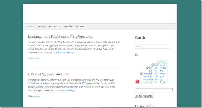
After about three or so months, ish got real. As you can see below, I added more texture to the design and put a super blurry fruit picture in the background of my header. Good times.
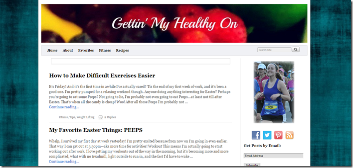
And then, we got a better camera, so I took a higher quality fruit picture as a header background and cleaned things up a tiny bit. Still had a lot going on though.
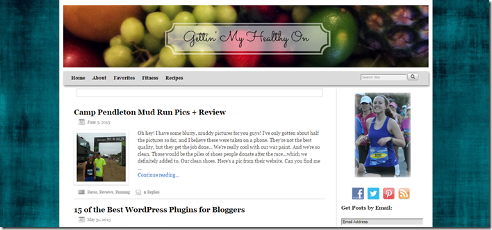
Then I decided to just go off the deep end. Haha. I finally made the plunge to purchase a few layout tools to create my own. I spent hours on this and never actually finished designing it.
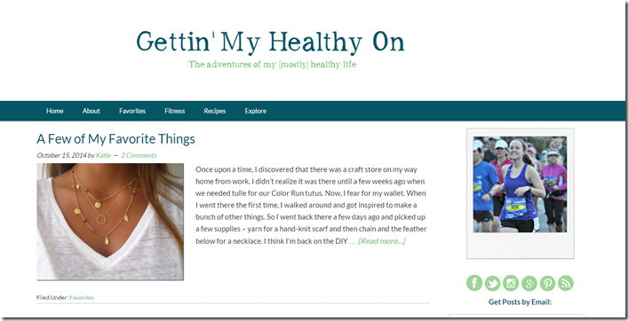
Then I completely replaced that design like a week later….because CODING IS HARD WHYYYYYY, and I basically couldn’t do what needed to be done, so I said TO HELL WITH IT and bought a clean, simple background. (As you can see, I still have lingering feelings about the frustrations of coding.) This new design was the best decision ever.
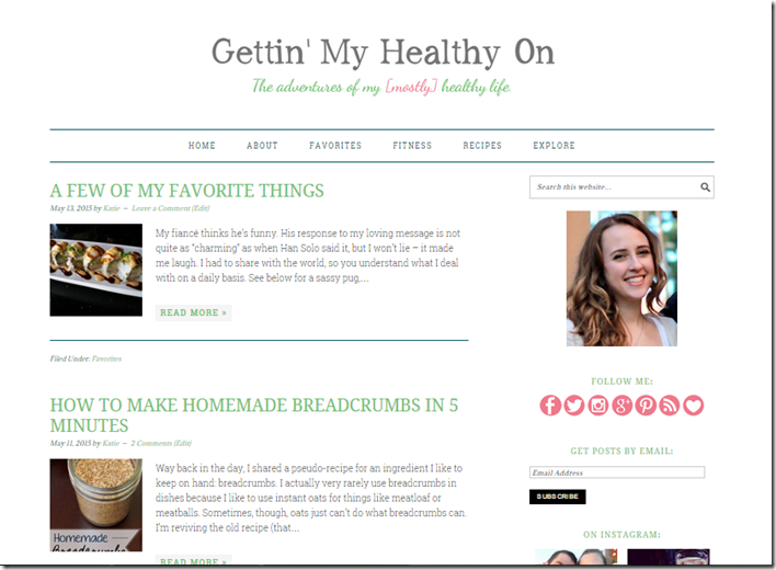
As you probably have noticed, that’s the design I have today. I stole my face out of an engagement picture (sorry, Matt; I only take one good picture every like…decade – okay, that’s not true, 15 was an awkward year for me), cut the crap from the earlier backgrounds, and put the focus of the design on the content/images. Will I keep this forever? Mmm no. But it’s funny because it’s more like my original design than all the weird, colorful ones in the middle.
So there you have it…the transformation of Gettin’ My Healthy On since it’s birth a few years ago.
Readers: how many of these designs have you seen while being a reader of this blog? What type of blog designs do you prefer?
Fellow bloggers: have you changed the design of your blog many times?

I got my first real design when I went self hosted last summer, but I’m still not happy with it :/
But I do love clean blog designs…but also some fun color!
Aww I like your blog design! It’s cute but still simple, so it doesn’t take away from your content at all. But ya, getting the perfect blog design seems like an endless endeavor. I’m just not willing to dish out a bunch of money at this point to get one I love. Maybe someday.